Visualization of Four Leading AI Models Compared
Image: © Ulrich Buckenlei
How can we make the cognitive abilities of language models tangible? Instead of long tables, new animated radar charts show how AI systems behave, evolve, and compare – visually, intuitively, and in real time.
From Numbers to Motion – Why We Visualize AI Models
What if you could not only read about the evolution of artificial intelligence, but actually watch it unfold? That’s exactly what animated radar charts enable. Instead of static figures, we see colorful shapes in motion: growing, tilting, pulsating. Each model visually reveals where its strengths lie – and where they don’t.
These moving points are not decoration. They represent thought processes, logical structure, abstraction capability, or language intuition. These visualizations provide insights into the mechanics of machine thinking – and help evaluate models in a more nuanced way.
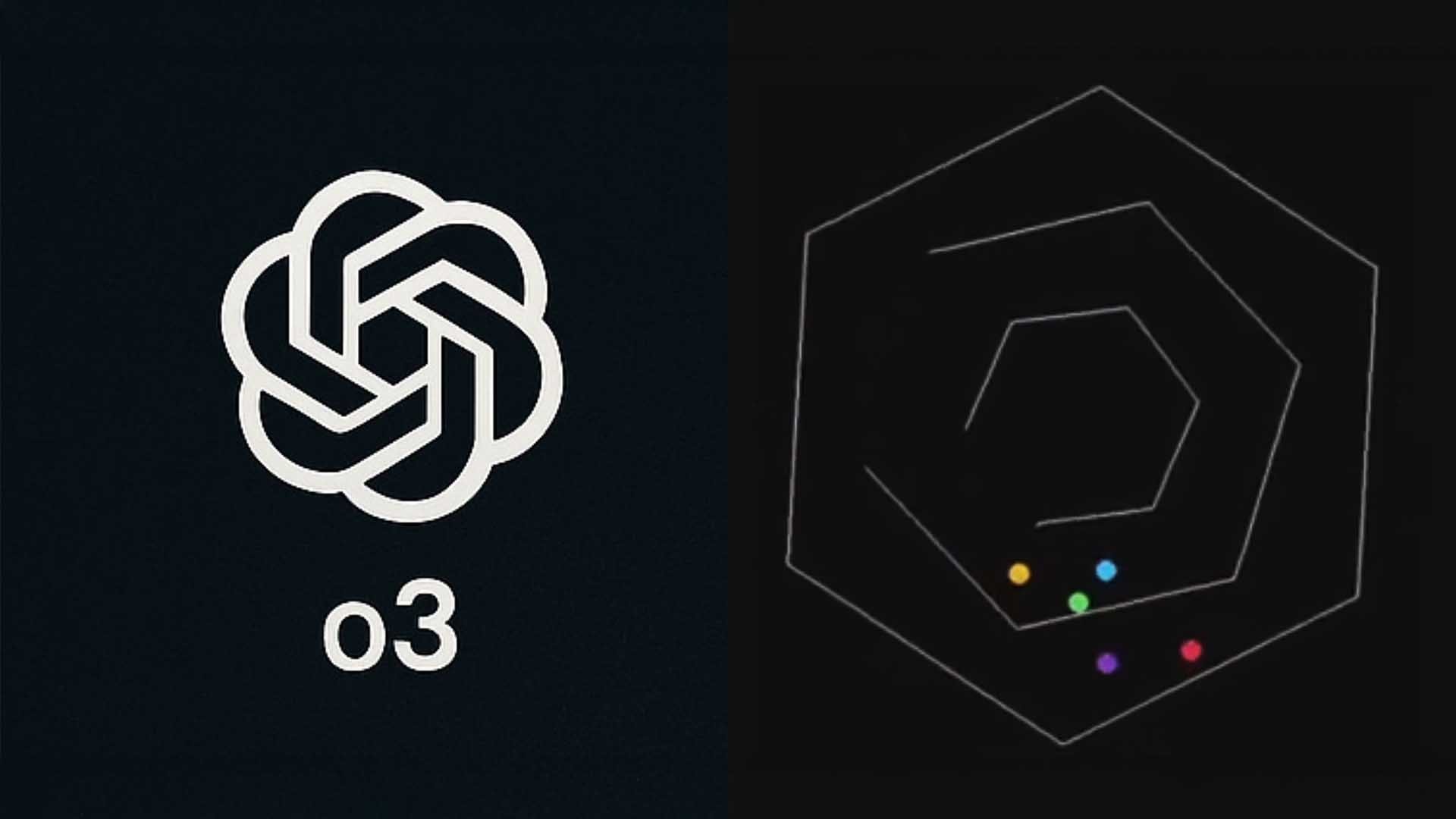
Visualization of Four Leading AI Models Compared
Image: © Ulrich Buckenlei | Special thanks to Flavio Adamo (@flavioAd) for the dataset benchmark and visual inspiration.
The simple juxtaposition of logos shows the baseline setup for the benchmark comparisons. The model selection is based on current benchmarks and availability in public evaluations.
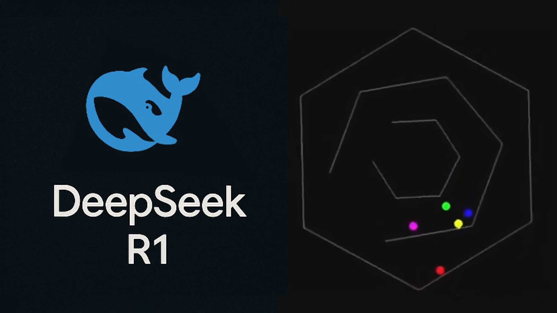
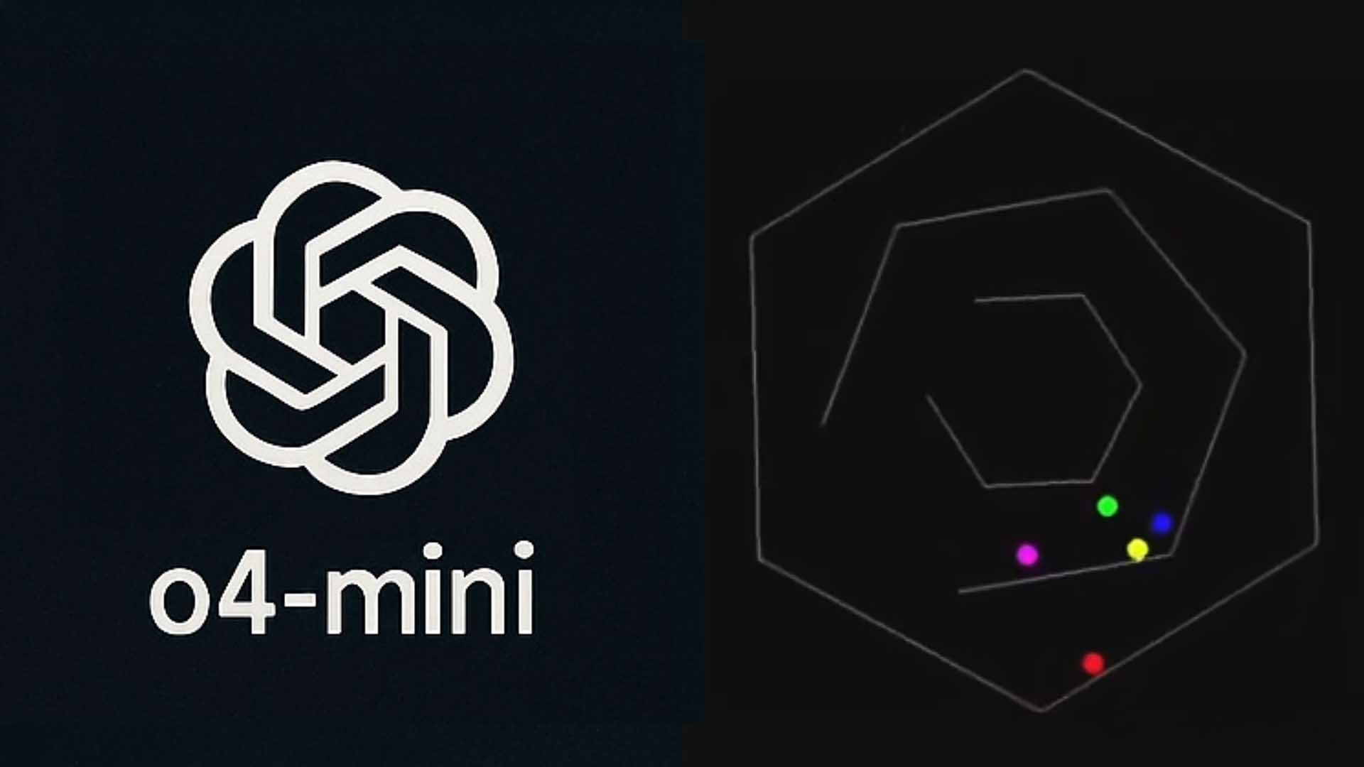
What the Moving Points Really Show
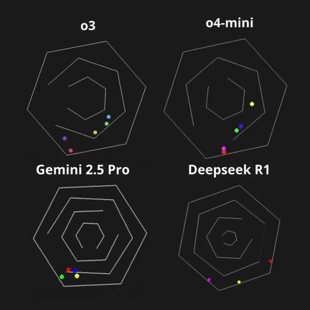
Each radar chart represents the “cognitive map” of an AI model – or at least a snapshot of it. Six axes define cognitive capabilities, from logic to language comprehension. The further a point is from the center, the more developed that ability is.
Through movement, we see how differently models evolve. Some gain strength in mathematics, others stagnate in logical reasoning. The animations reveal variations that are often lost in static scores.
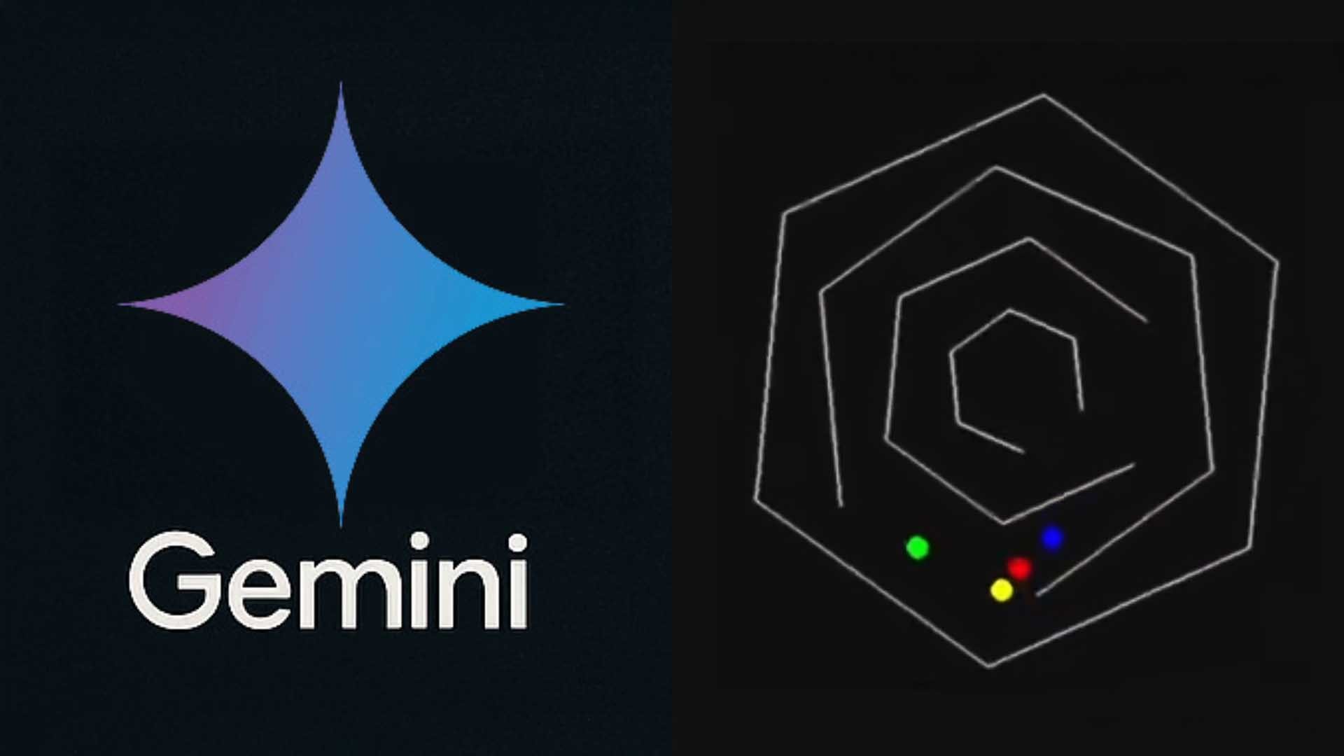
Live Evolution of Capabilities in 6 Areas per Model
Image: © Ulrich Buckenlei | Special thanks to Flavio Adamo (@flavioAd) for the dataset benchmark and visual inspiration.
This graphical comparison in motion enables intuitive understanding of strengths and weaknesses – an ideal tool for developers, researchers, and decision-makers.
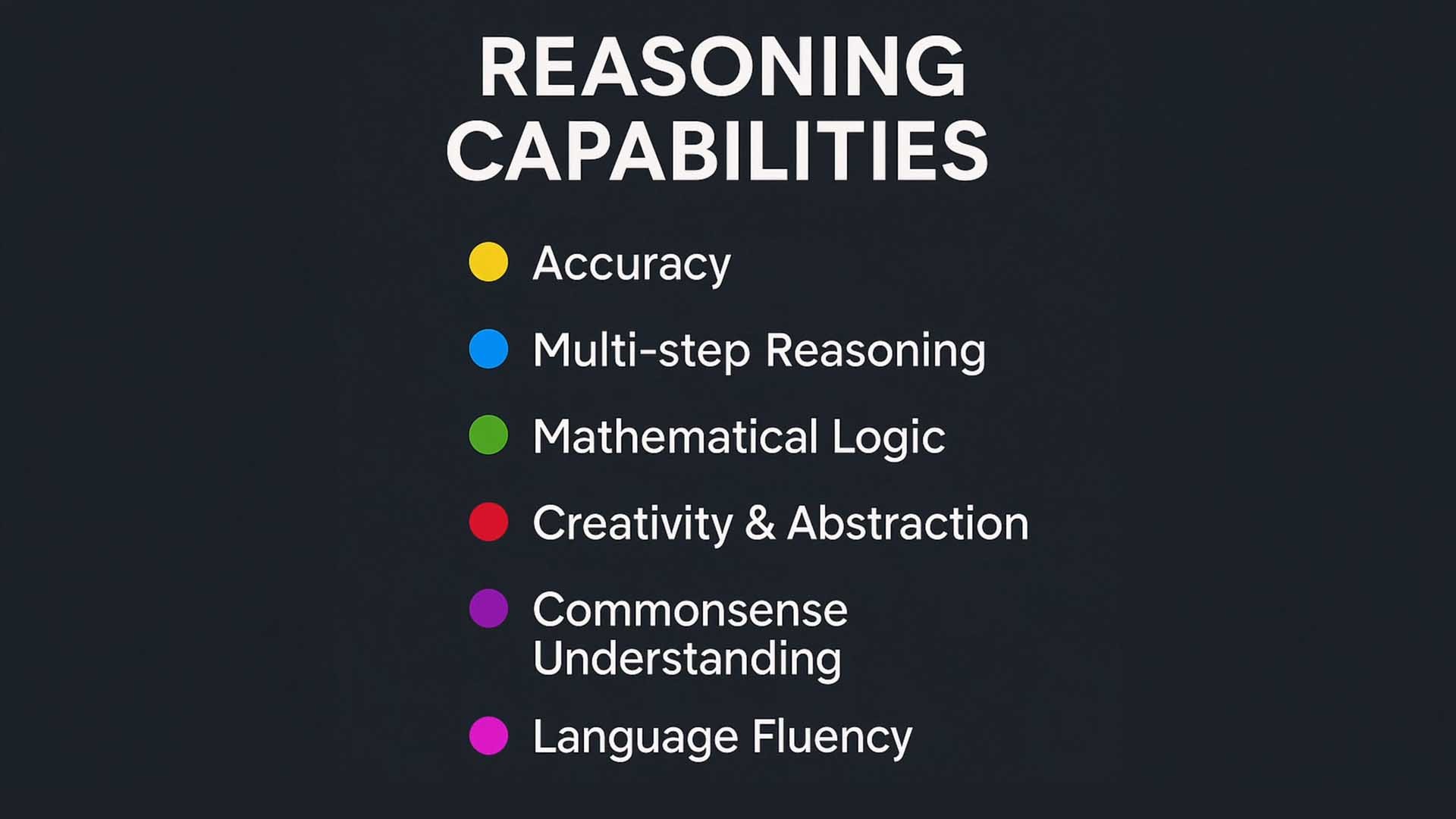
Cognitive Abilities in Color – How to Read the Charts
To ensure the animations remain easy to understand at a glance, each axis is color-coded. These colors represent cognitive abilities – from logical structure to language fluency. The color scheme supports quick readability and comparability of the models.
What’s interesting is not just the maximum value of a single color, but the shape of the entire grid: Is it balanced? Are there drop-offs? Where is a model highly specialized?
Color Coding of Benchmark Parameters for Better Comparability
Image: © Ulrich Buckenlei | Special thanks to Flavio Adamo (@flavioAd) for the dataset benchmark and visual inspiration.
Yellow stands for multi-step reasoning, green for mathematical logic, blue for factual knowledge – each color tells part of a model’s story.
More than Benchmarks – It’s About Cognitive Storytelling
Many view radar charts as mere technical evaluations. But in truth, they tell stories. A model with an asymmetrical profile appears as a specialist – another with a round shape shows cognitive balance. These forms don’t just visualize data; they make thinking patterns tangible.
This becomes especially clear with models that have different profiles. You begin to realize: AI is not just a score – it’s a system with distinctive thinking styles.
Different Models, Different Motion Profiles – Benchmark with Personality
Image: © Ulrich Buckenlei | Special thanks to Flavio Adamo (@flavioAd) for the dataset benchmark and visual inspiration.
These benchmarks show that intelligence can also be communicated visually – clearly, understandably, fascinatingly. And each new model generation brings its own shape.
Why This Matters – And to Whom
The development of large language models is progressing rapidly. But how can this progress be conveyed in a way that decision-makers and creatives can intuitively grasp? Visualizations like these provide just that: a bridge between technology and understanding.
They help make complex dynamics comprehensible – and open up entirely new use cases for benchmarking, training, and education.
Observe Performance Live – For Developers, Decision-Makers, and Creatives
Image: © Ulrich Buckenlei | Special thanks to Flavio Adamo (@flavioAd) for the dataset benchmark and visual inspiration.
Whether for developers, product managers, or education teams: These visualizations make AI not only measurable but also understandable – and thus controllable.
Infographic: Overview of the Six Core Cognitive Competencies
The following infographic summarizes the six core capabilities. Color-coded, thematically structured, and ideal for use in presentations or decision templates.
Cognitive Comparison Dimensions of LLMs: Color-Coded
Image: © Ulrich Buckenlei | Special thanks to Flavio Adamo (@flavioAd) for the dataset benchmark and visual inspiration.
This graphic is also available as a PDF or SVG for further analysis – simply contact the Visoric team.
The Video of the Benchmark Series
The following image serves as the poster frame for the benchmark video that shows all models in live motion. It’s part of a series that continually adds and compares new models.
LLM Benchmark in Motion – Evolution of Intelligence
Image: © Ulrich Buckenlei | Special thanks to Flavio Adamo (@flavioAd) for the dataset benchmark and visual inspiration.
Join In, Think Along, Keep Thinking
- Want to visually benchmark your own model?
- Planning an education tool with animated charts?
- Need customized visualizations for decision-making bodies?
Then contact the VISORIC expert team in Munich. We create the right visuals – from concept to integration.
Contact Persons:
Ulrich Buckenlei (Creative Director)
Mobile: +49 152 53532871
Email: ulrich.buckenlei@visoric.com
Nataliya Daniltseva (Project Manager)
Mobile: +49 176 72805705
Email: nataliya.daniltseva@visoric.com
Address:
VISORIC GmbH
Bayerstraße 13
D-80335 Munich